Visualising London Boroughs with Folium
08 Mar 2020Lately, I’ve been playing around with Folium, a Python library that lets you quickly make interactive maps.
I’ve been doing this for two reasons: partly because it’s quite a fun (and relatively painless) library to work with, and partly because I’m attempting to complete IBM’s professional certificate in data science at the moment, and Folium features heavily in the later sections; in fact, writing this post about how I’ve been using Folium is part of the final assessment.
With Folium, making basic maps is trivial:
folium.Map()
The short line of code above will create an interactive (pan and zoom) map of the Earth, complete with borders, rivers, cities, and roads. It’s only slightly more complex to choose your starting point and level of zoom:
folium.Map(location=[51.0260617, -1.3993741], zoom_start=17)
Where Folium really shines is when you want to overlay information onto maps: to add markers or even choropleths. To practice and demonstrate this, I’ve been building interactive maps of London.
Purpose
As noted above, the major reasons I’ve been experimenting with Folium are because it’s part of a course, and because I think it’s interesting. However, I do have a more practical rationale as well.
There are many different areas of London, and many different people looking to move into the city. Newcomers to London don’t have an easy way of finding out what each area is like, meaning that their initial search for living spaces is not as well-informed as would be ideal.
I’ve created interactive maps of London boroughs, so that people can quickly and easily see the key features of different areas and work out where they’d like to live.
Data sources
The data used in this project comes from several different places:
- The London datastore, which contains information about the different areas of London and the demographics of the people who live there
- A geoJSON file of London boroughs, used to build the interactive maps in the right places
- The FourSquare API, to get details of venues in a particular area.
Data Processing
In order to carry out this analysis, I had to do a decent amount of processing/collating data. Read this notebook if you’re interested in the actual steps taken to produce the final results.
Results
I produced three final visualisations, each one displaying different aspects of areas (or an area) in London. All visualisations have some interactive elements, allowing users to select different aspects of the data to overlay, or include/exclude specific types of map marker.
Embedding the maps so that they work neatly on all screen sizes is a bit of a pain, so instead, for each map I’ve provided an example image and a link to the live, interactive map.
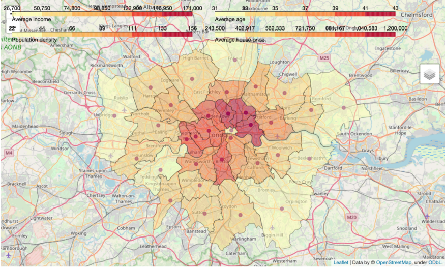
Choropleth of practical demographic information
Average age, income, house price, and population density
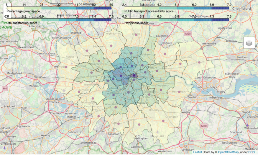
Choropleth of quality-of-life information
Happiness, life satisfaction, percentage green-space, access to transport
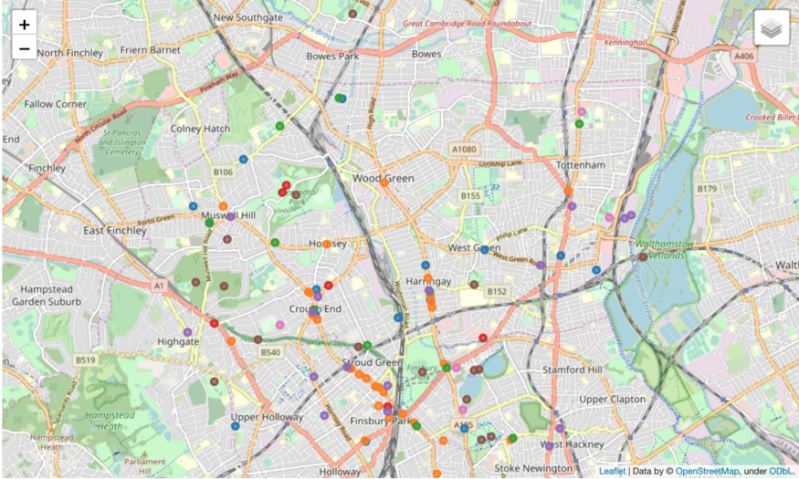
Map of the Haringey borough, with a sample of venues in the area
Different venue types are independently toggleable
Conclusions
With the visualisations created above, it’s possible to get a quick overview of which boroughs are most affordable, accessible, etc. This could be used by people looking to move into London who don’t already know the various areas that well.
From a personal perspective, I’ve enjoyed playing with Folium and learning all of its quirks. It’s the most accessible mapping library I’ve used with Python, though it does have some odd moments and limitations, like the way that choropleth legends aren’t toggled off when you toggle the choropleth itself. I’m looking forward to exploring the library further, finding even more ways to customise maps.